Crafting Jetty's Unique Brand
When we set out to create Jetty's brand, we wanted it to reflect the founders' love for all things sea-related while staying true to the technical nature of our product. It was a fun journey that brought together the precision of our platform and the captivating charm of the ocean.
Getting Inspired by the Sea
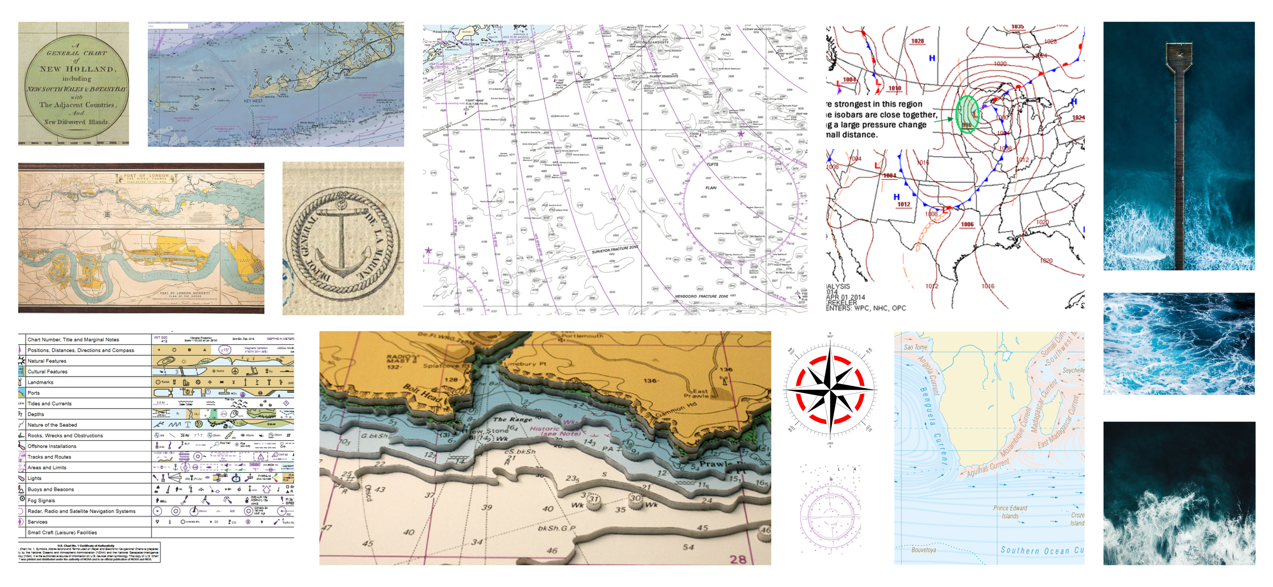
The founders had a clear vision – they wanted a brand that had a maritime touch, something that felt like it belonged in the world of naval maps and hydrographic data. We dug into nautical charts and marine codes to find inspiration that would make our brand unique.
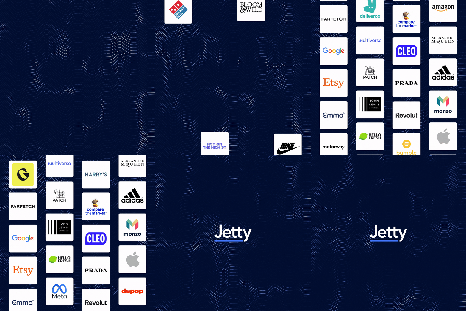
Our brand identity dances between waves and lines. The wavy lines represent the sea's rhythm and the ever-changing currents of talent and tech. They also bring a bit of that ocean charm into our image. On the other hand, straight lines reflect precision and accuracy, just like the technical maps we found inspiration in.
Moodboard
Jetty’s Logo
The inspiration for the Jetty logo came from the simple yet powerful image of a jetty, a structure extending into the water, providing a safe passage to boats. In our context, Jetty serves as a similar gateway, enabling candidates to embark on a new journey.
Concepts
The Logo
The Element
At the heart of our logo stands the jetty itself as a solid line, representing a dependable structure, just like our platform. It represents the bridge between candidates and their new roles, emphasizing the idea of a safe and secure passage.
The Colors
For our color palette, we chose deep ocean blues, inspired by the vastness of the sea. These colors invoke a sense of trust, reliability, and the endless potential that Jetty offers. They also tie in with the maritime theme, aligning with the concept of safe passage and adventure.
The Typography
The typography used in the logo is clean and modern, reflecting the tech-savvy nature of our product. It's easy to read, making it accessible to all, just like our platform aims to be.
Iconset
The Jetty iconset draws inspiration from the sea, merging maritime symbols with representations of our various categories. It's a clean, straightforward way to convey a connection between the two.
Illustrations
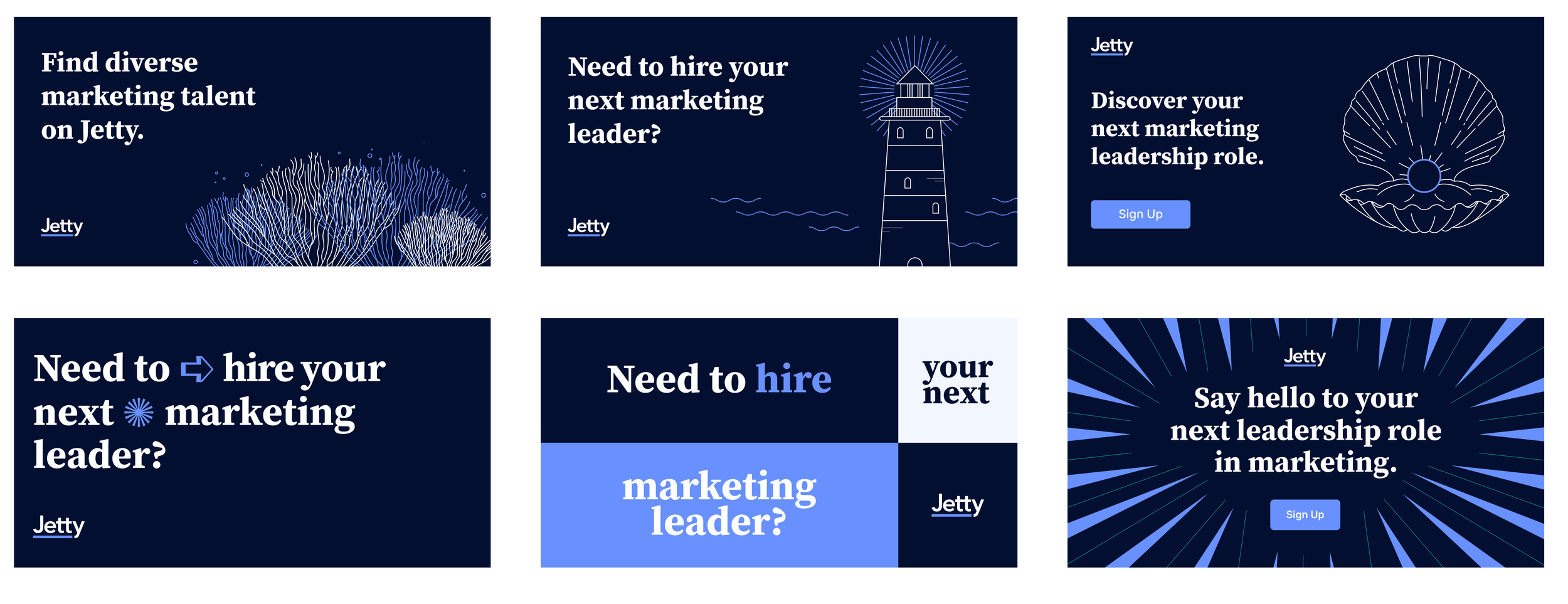
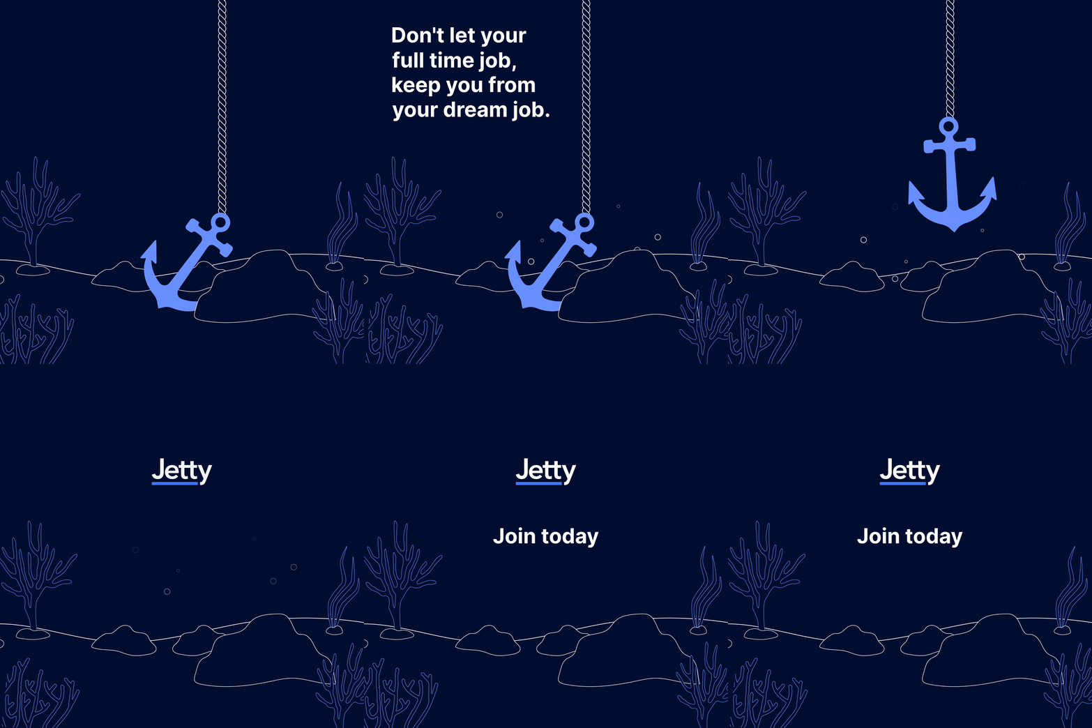
The illustrations are crafted using a think stroke, in harmony with the brand's aspiration for a technical yet minimalist aesthetic.


