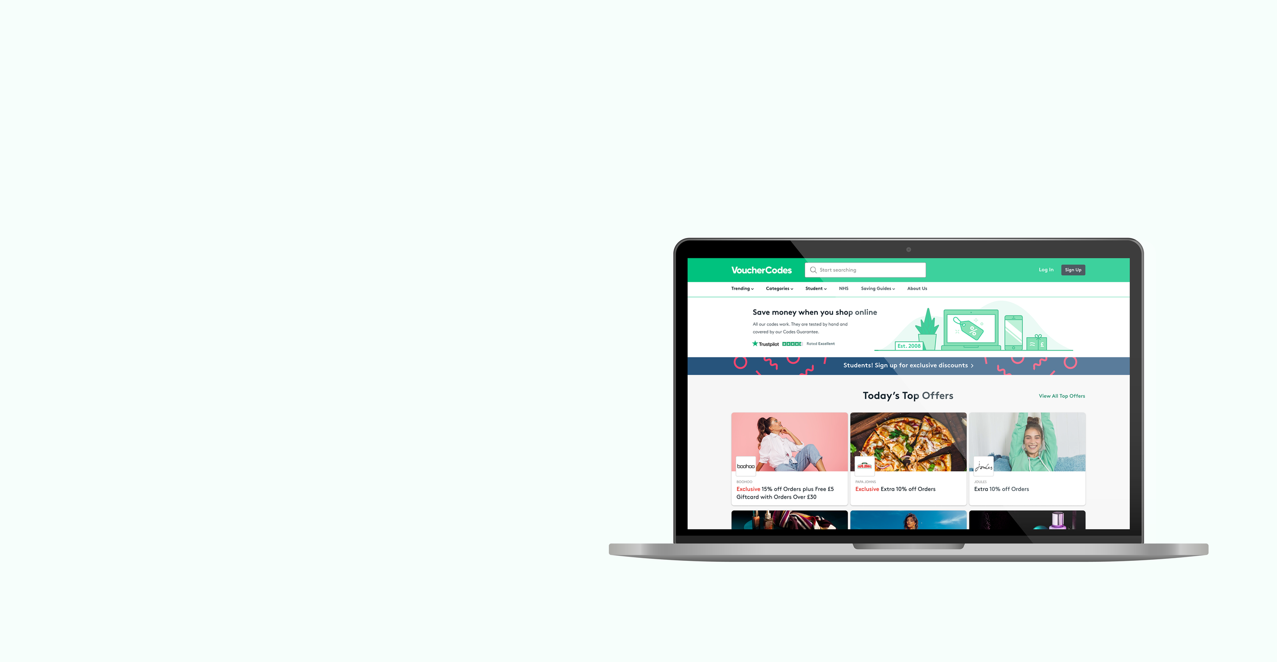
VoucherCodes homepage
Client: VoucherCodes (2022)
Role in the project: Research and Design (UX/UI)
Brief: To create a more engaging homepage for the users and show content that is interesting to them. Additionally, we had to make sure to emphasise the brand and to show the company’s Expertise, Trustworthiness and Authoritativeness (Google’s EATs).
Project summary
For this project, there were several factors we had to consider. Apart from achieving a better and more personalised user experience, we had to take into account the merchants’ requirements since they pay to be advertised on the site.
In addition, we had to make sure to include Google's EATs. Here’s a breakdown of some points we had to consider:
- The Purpose of the Page (is there a beneficial purpose?)
- Expertise, Authoritativeness and Trustworthiness (EAT)
- Main Content Quality and Amount
- Information about the website or the Main Content creator
- Reputation of the website or the author of the Main Content
The more a page demonstrates expertise, authority, and trustworthiness, the higher it should rank in search engine queries. We can positively say we have ticked all the boxes that make the VoucherCodes site a great one that follows Google’s guidelines.
Next, you can find more information about the timeline, research and design process (from problems to solutions)


1.Research
Google Analytics & User testing
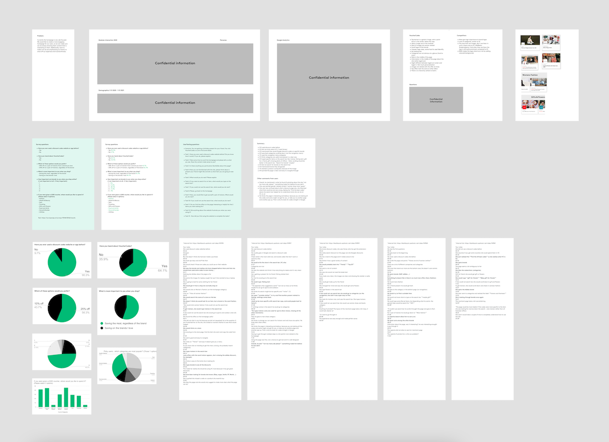
We collected data from Google Analytics and also some valuable insights the Business Analytics team provided.
We carried out unmoderated sessions and interviews as well.
Some key insights were:
- We had been overlooking our demographics
- We realised our users could not relate to imagery and felt overwhelmed navigating the homepage
- Our features (what makes us stand out from competitors) were not clear to our users
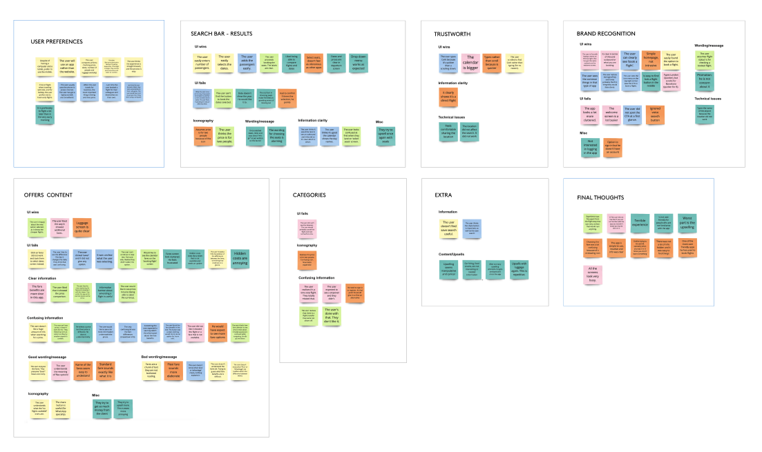
Affinity diagram
We created an Affinity Diagram to make sense of all of our findings. The purpose of the Affinity Diagram is to organize user feedback and try to search for trends that might have been alluded to but never explicitly stated
2.Design
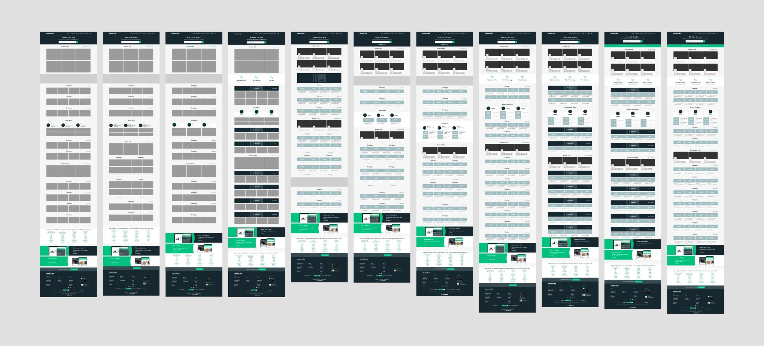
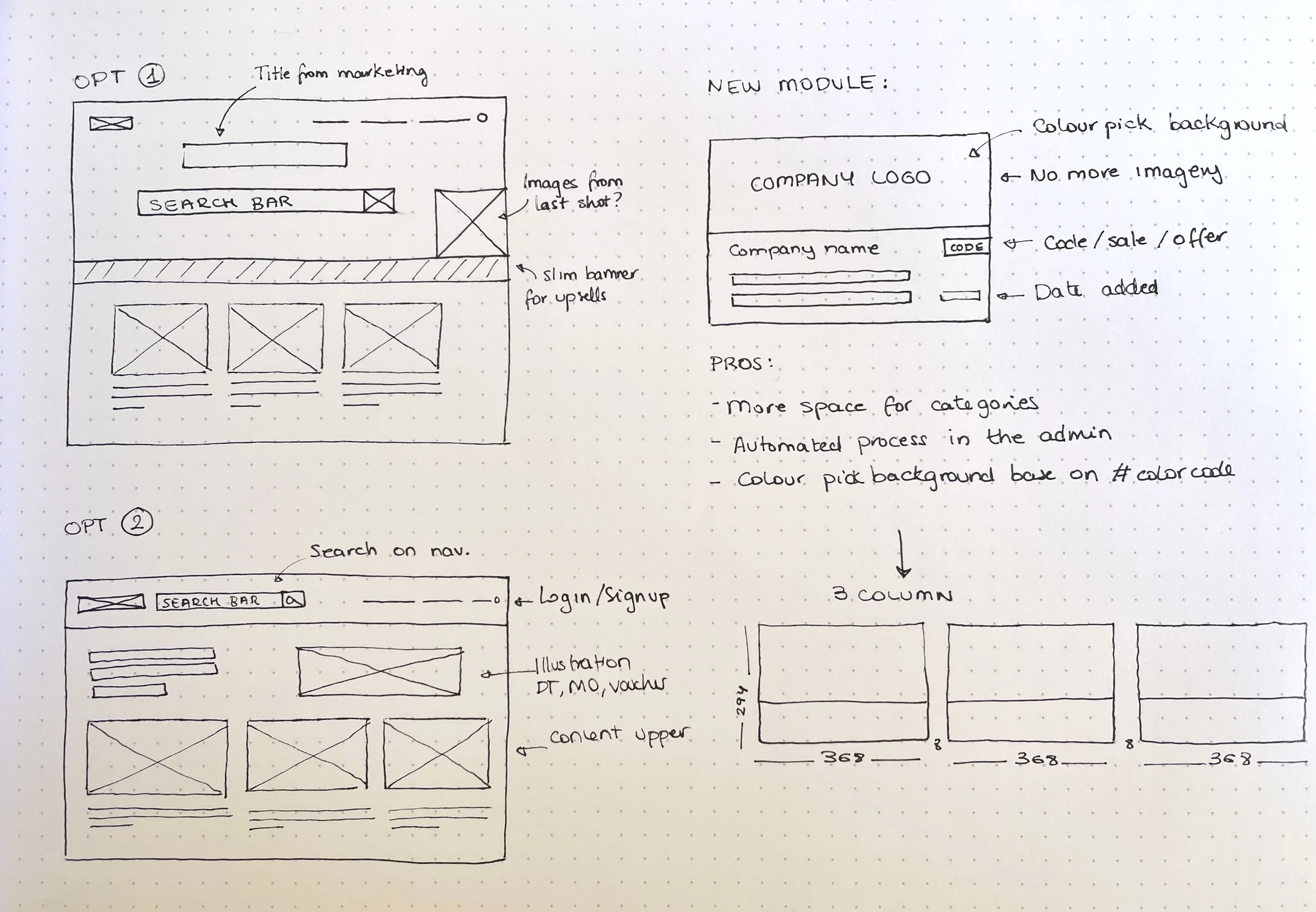
Sketches / Wireframes
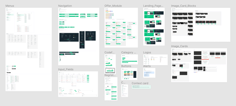
We created the design system in Figma.
The design team migrated Sketch components to Figma (2019). These needed major redesign, so we created a brand new Design System. For the updated homepage we also created new components.
Design System
3.Results
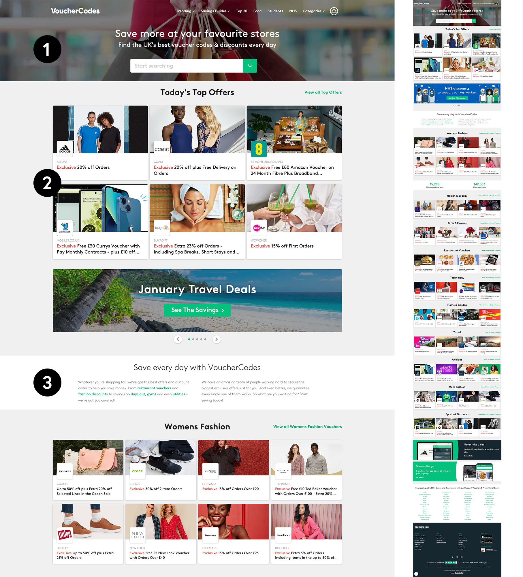
Previous design
(1) Navigation and hero banner
- Navigation was inconsistent across the pages.
- Limited space to add more categories in the navigation.
- Dated background image that did not reflect the brand core.
(2) Image/offer modules
- Providing imagery weekly to fill the dozens of modules was a tedious job for the design team.
- Often, images did not correspond to the offer title.
- Pictures were sometimes gender-misleading and users could overlook some offers.
- Some brand logos were difficult to see in the tile.
- Categories looked the same as Top Offers. There was a placement hierarchy, but not a visual one.
(3) SEO
- Text added on the homepage for SEO reasons did not look appealing and was usually ignored by users.
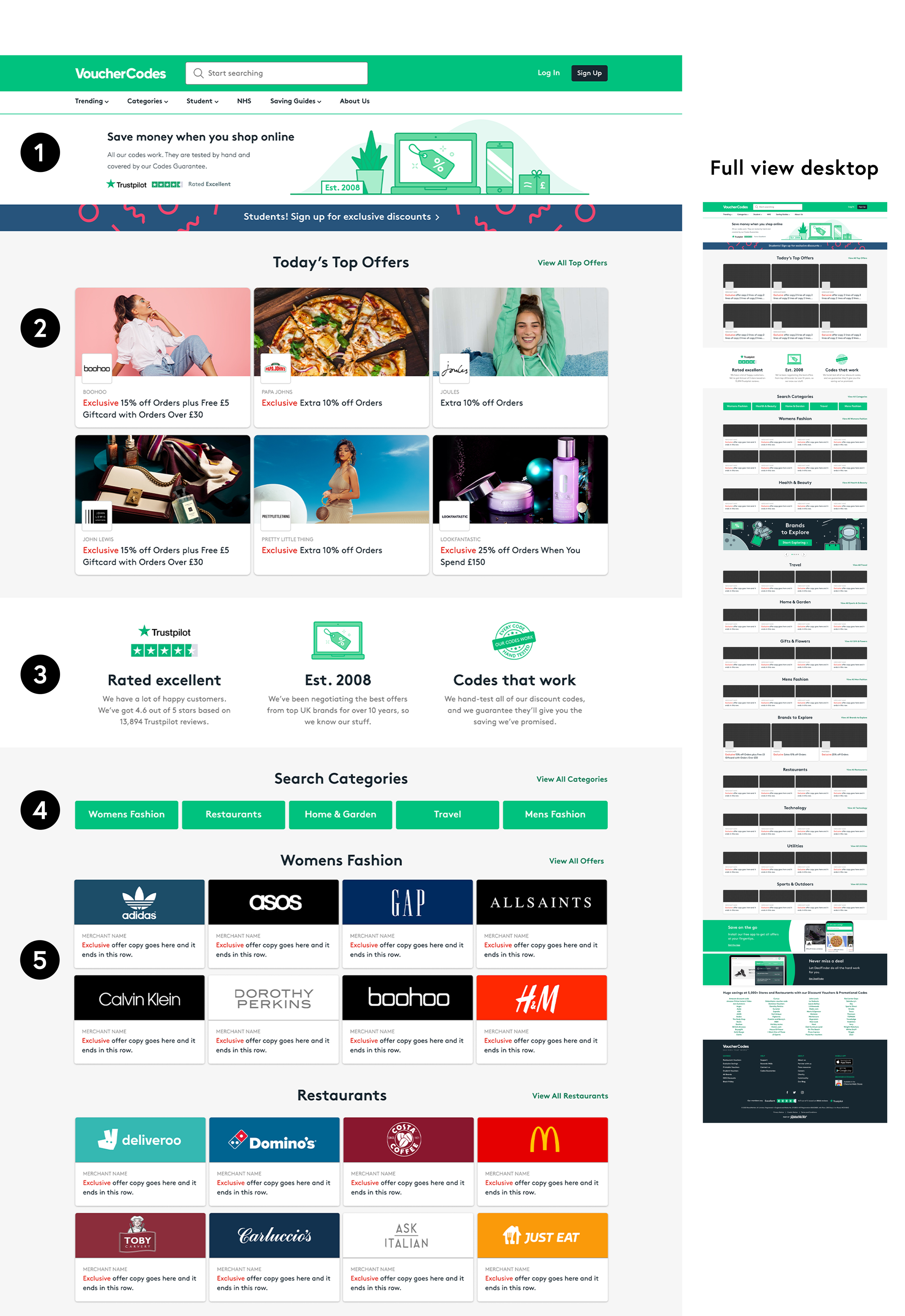
(1) Navigation and hero banner
- Navigation is now consistent across all pages. This was a collaboration with another designer’s project.
- There is more space for categories.
- The new illustration reflects VC products better.
- The Trustpilot logo is at the top, increases trust.
- There is a slim banner that will be used to bring sign-ups and promote marketing campaigns. Now it stands out and doesn’t take up much space, keeping content high up on the page.
(2) Image/offer modules
- “Top Offers” image modules have been kept to highlight that this section is a premium spot.
(3) SEO
- Banner with key information for Googles’ EATs.
- Information is shown in a clear way. It is easier to read and more catchy than the previous design.
- The new copy lists why VoucherCodes is better than its competitors.
(4) Quick search categories
- Quick search tags immediately take users to the content they are looking for, eliminating unnecessary scrolling.
(5) Logo/offer module
- Logos replacing images in the modules: By making the brand logo bigger people identify brands quicker. This is an update our partners loved.
- We created 760 logos: Transparent PNGs with the HEX colour included in the file name. This allows automatic background colour pick in the admin. The logos are uploaded automatically, saving a huge amount of manual work for the content team. Communication with engineers was key in this part of the process to make it successful.
- Less work for the design team creating imagery
New design
Accessibility
We are making adjustments across the site to make sure everything passes W3C’s accessibility guidelines.
We have started implementing changes that are already live on the homepage.
Achievements
Category optimisation:
- Minimalist Clean Design: Less is more. We got rid of pop-ups, CTAs, and unnecessary information that could overwhelm and distract the users.
- Optimized Filters: We now have a good, converting category page that is fully browsable and searchable.
- Product Splits and Scrolls: The way our products are split across several pages for each category will impact the user-friendliness of the site.
- We are keeping just the right balance of information on the homepage.
- Clear Category Names: Clear and concise names will help the users to search easily for what they are looking for.
SEO optimisation:
- Keyword Optimization: We focused on improving Google’s EATs, reviewing keywords and a SEO banner.
- Internal Linking: By adding internal links to our category page, we boost rankings.
- Load Speed: Page speed is an important Google ranking factor. By reducing imagery usage, the loading speed is already faster.
Challenges
For this project, we had to consider 3 main points: Our customers, our partners and the viability of the proposal. Due to staff shortage, the project kicked off without a Project Manager, I took on the responsibility of managing communication between the different departments (Partnerships, Content Operations and Engineering) to ensure all the points in the proposal were feasible. It also allowed the team to receive and implement feedback throughout each stage of the design process. Despite being a challenge, I successfully managed the communication between teams in addition to upholding the responsibilities of my own role within the project.
Another challenge was to source the thousands of logos the site hosts. We decided to go through data collected by the BA team and filter brands that had booked a slot on the homepage for the last 3 years. We saw a pattern of brands having more presence on the homepage, so we could filter them down to 1,000 (from an initial figure of 10,000). The design team worked on creating those PNGs in a way that they could be automatically uploaded to the admin. We also automated the colour picking of the images’ background colour by inserting colour codes in the file names. These new logos have been well received by our merchants and we are looking for new ways to implement those across the site, the app and DealFinder as well.
Dark Mode — Hackathon Project
Role in the project: Lead (Idea contributor)
Research and Design (UI)
Time spent on the project: 1 hackathon day
For the 2022 VoucherCodes Hackathon I briefly worked on the dark mode version of the Homepage and a Merchant page. Following this article about energy saving (by using dark mode), I created a prototype to demonstrate my idea.
If you want to see more, here is the prototype.
